← Features

FEATURE

Activity Reports

Which epics and people actually absorbed time this period — measured in elapsed hours, not a performance ranking.

What it does

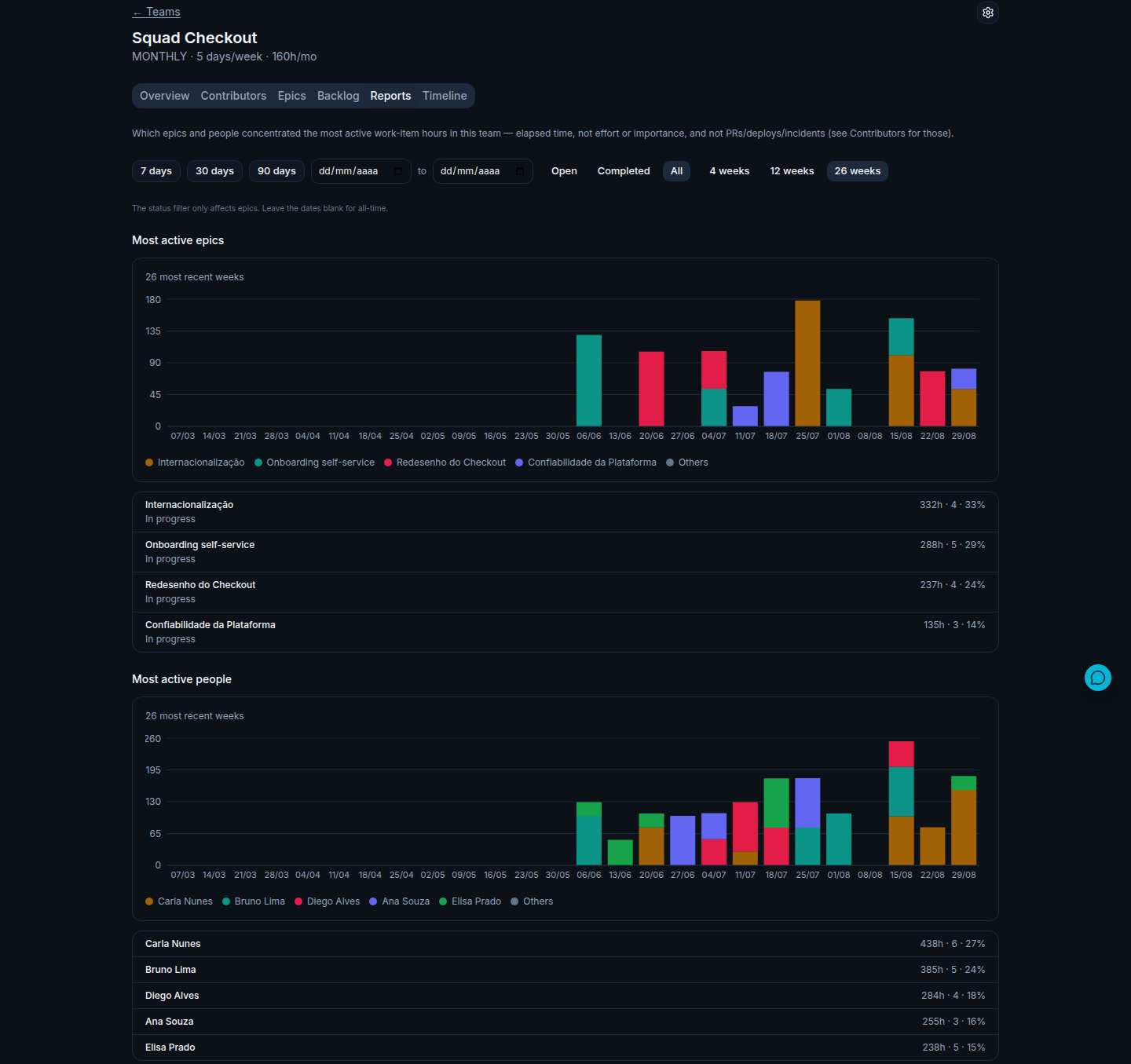
Two views: the org-wide dashboard shows a card each for the most active epics and the most active people this period, and each team's page has a dedicated "Reports" tab with the full ranked list plus a weekly stacked chart of the top 5 (grouped as "Others" beyond that). "Active" means time actually elapsed working on items tied to that epic or person — not a score, not an impact rating.

moasy.tech Reports tab for a team showing Most active epics (Internacionalização, Onboarding self-service, Redesenho do Checkout, Confiabilidade da Plataforma) and Most active people (Carla Nunes, Bruno Lima, Diego Alves, Ana Souza, Elisa Prado), each with hours and share of the period

Illustrative data, for demonstration purposes only.

How it works

  1. Sync

    Sourced from the same Jira/Linear work item history already used for Flow Metrics — no separate integration, no manual tracking.

  2. Measure elapsed time

    For each completed item, time is measured from when work actually started to when it finished, then rolled up per epic and per person for the period.

  3. Rank by time, not by score

    Epics and people are ordered by time absorbed — deliberately not framed as a "top performers" leaderboard, because elapsed time isn't the same thing as impact or effort.

  4. Report

    The dashboard shows the current snapshot; each team's Reports tab adds the full list and a week-by-week stacked view of where that time actually went.

Why it matters

Not a performance ranking

This measures elapsed time on work, not output, quality, or impact — the same reasoning behind why Capacity & Workload's contributor breakdown exists to spot overload, not to rank people. Use it to find where time is going, not who's "winning."

Different question than the epic Gantt

The epic breakdown in Flow Metrics shows the hierarchy and duration inside one epic. This is the other direction — which epics, across the whole team, absorbed the most time this period.

Doesn't duplicate contribution concentration

Capacity & Workload already covers pull requests, deploys and incidents per contributor — this report deliberately sticks to work-item time only, instead of mixing units that don't compare cleanly.

Trend, not just a snapshot

The Reports tab's weekly chart shows whether time is concentrating on the same epics and people week over week, or shifting around — a pattern a single snapshot can't show.

Questions about activity reports

Is this a ranking of who's the best performer?

No — it ranks by elapsed time on work items, which isn't the same as effort, quality, or impact. Treat "most active" as "absorbed the most hours," not as a performance judgment.

How is this different from the epic breakdown in Flow Metrics?

The Flow Metrics epic breakdown (and its Gantt view) shows the internal timeline of one epic — when it started, when it finished, what's inside it. This report answers a different question: across every epic, which ones absorbed the most time this period.

Does this include pull requests, deploys or incidents?

No — that's what Capacity & Workload's per-contributor breakdown already covers. This report sticks to work-item time specifically, so the two numbers don't get mixed together.

See your own activity reports

Get started free
moasy.tech Reports tab for a team showing Most active epics (Internacionalização, Onboarding self-service, Redesenho do Checkout, Confiabilidade da Plataforma) and Most active people (Carla Nunes, Bruno Lima, Diego Alves, Ana Souza, Elisa Prado), each with hours and share of the period